Logo
The Everbright logo plays a crucial role in defining our brand identity. To keep it instantly recognizable across all surfaces, it’s important to adhere to consistent guidelines for placement, sizing, clear space, and color usage. Additionally, this section will explore exciting aspects of sub-branding, co-branding, our social media symbol, and the app icon. By following these guidelines, we can proudly showcase the Everbright brand in the best possible light!
Minimum logo clearspace
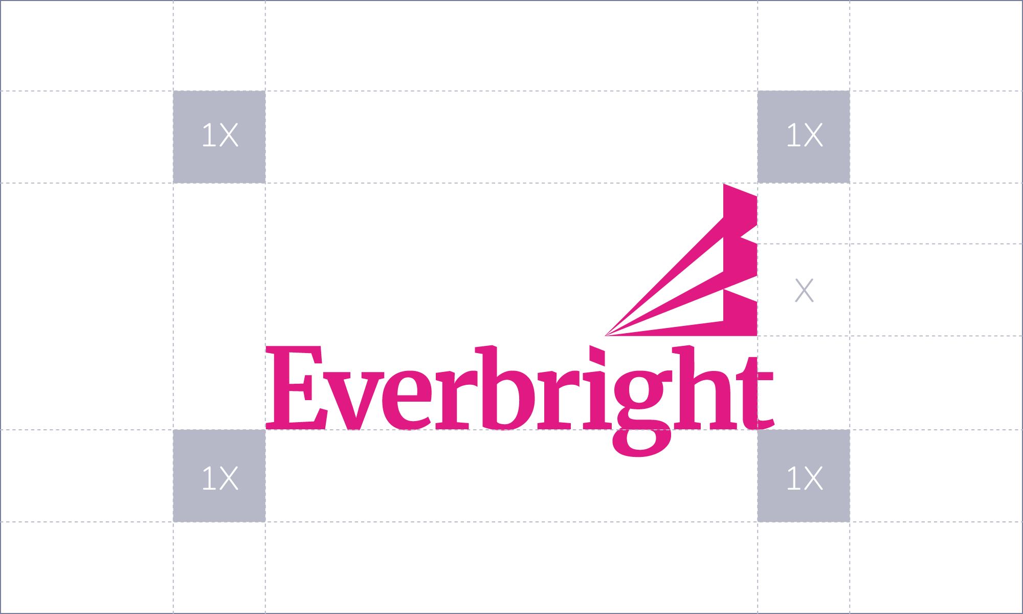
To achieve the best presentation of the logo, it is important to maintain generous clear space around it, free from any margins or elements. This principle, defined by the size of X outlined below, significantly enhances the logo’s visibility and impact.

Sub-branding
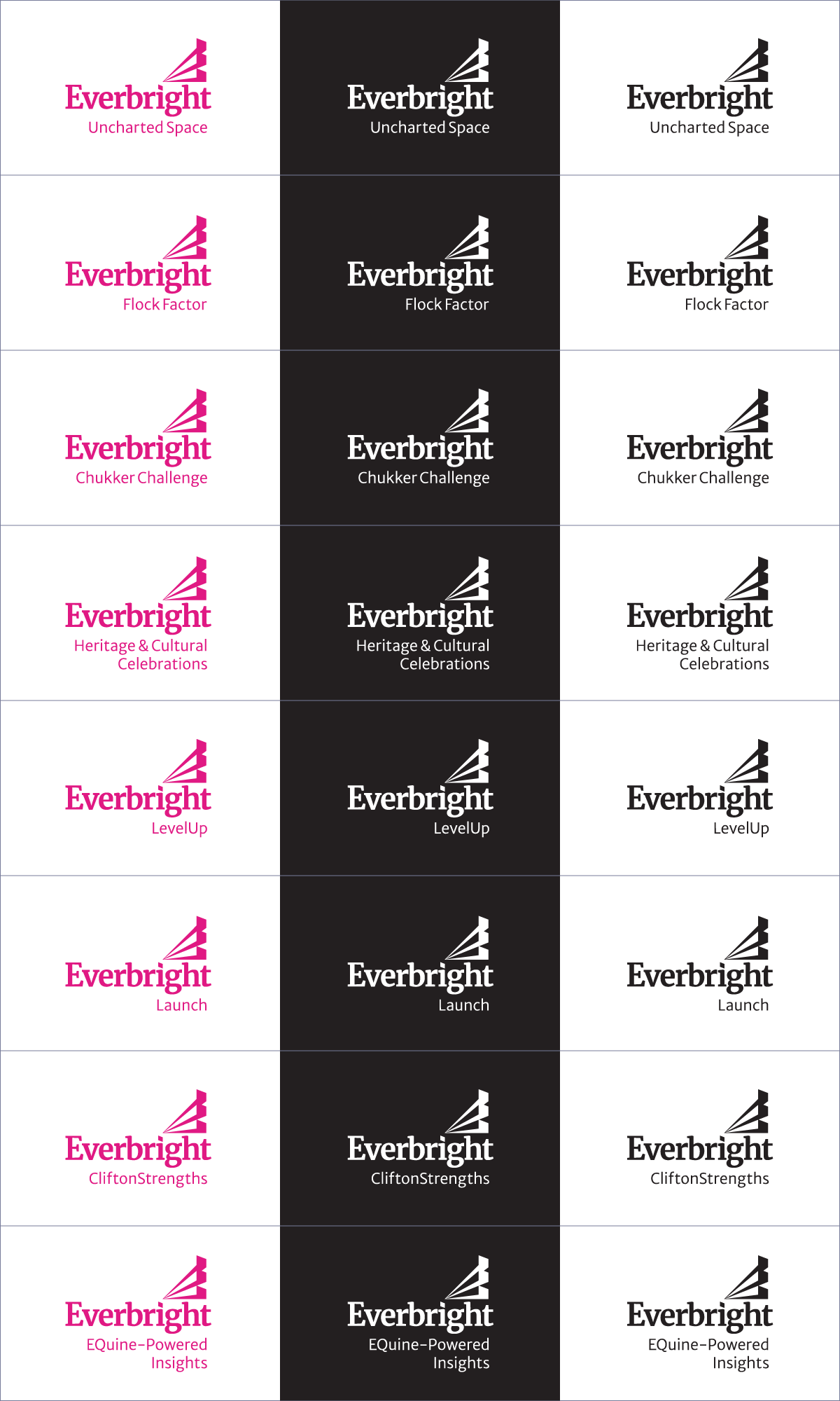
The simplicity of our logo allows it to have various lock-ups when we communicate our products or progams—e.g. Flock Factor, Chukker Challenge, or Launch.
Co-branding
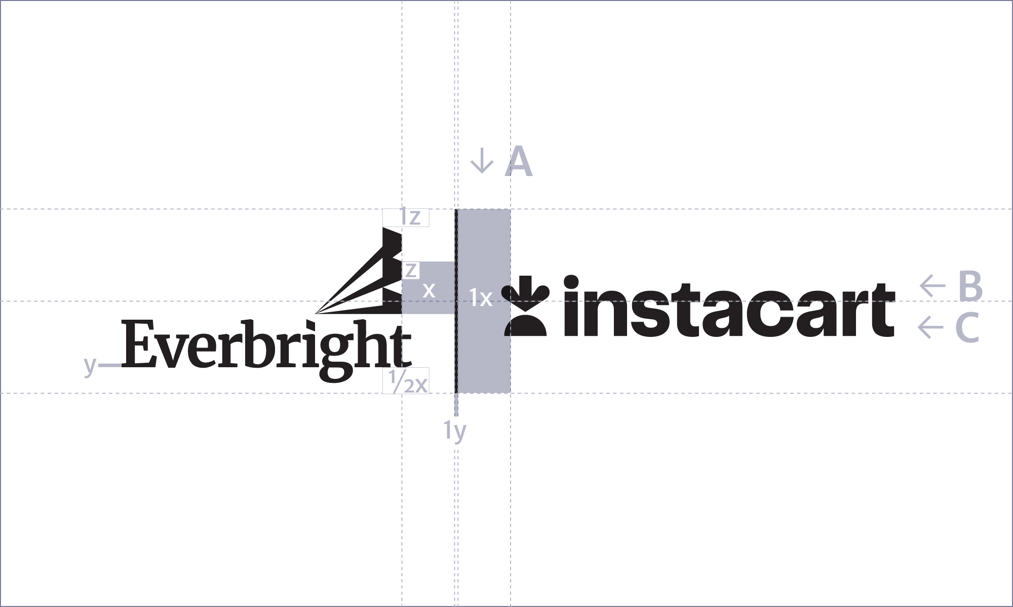
When we collaborate or partner with other brands, we have developed a system for co-branding. Either Everbright leads, or the collaborator leads. Both options are ok. Depending on the surface the logos are visible on, we can choose between horizontal and vertical lock-ups.

Horizontal system for Everbright/Partner Brand
A: This white space needs to be visually balanced rather than mathematically correct
B: This logo size needs to visually match the weight of the Everbright logo
C: This logo size needs to be visually centered rather than mathematically centered
Horizontal system for Partner Brand/Everbright
A: This white space needs to be visually balanced rather than mathematically correct
B: This logo size needs to visually match the weight of the Everbright logo
C: This logo size needs to be visually centered rather than mathematically centered

Horizontal system for Partner Brand/Everbright
A: This white space needs to be visually balanced rather than mathematically correct
B: This logo size needs to visually match the weight of the Everbright logo
C: This logo size needs to be visually centered rather than mathematically centered
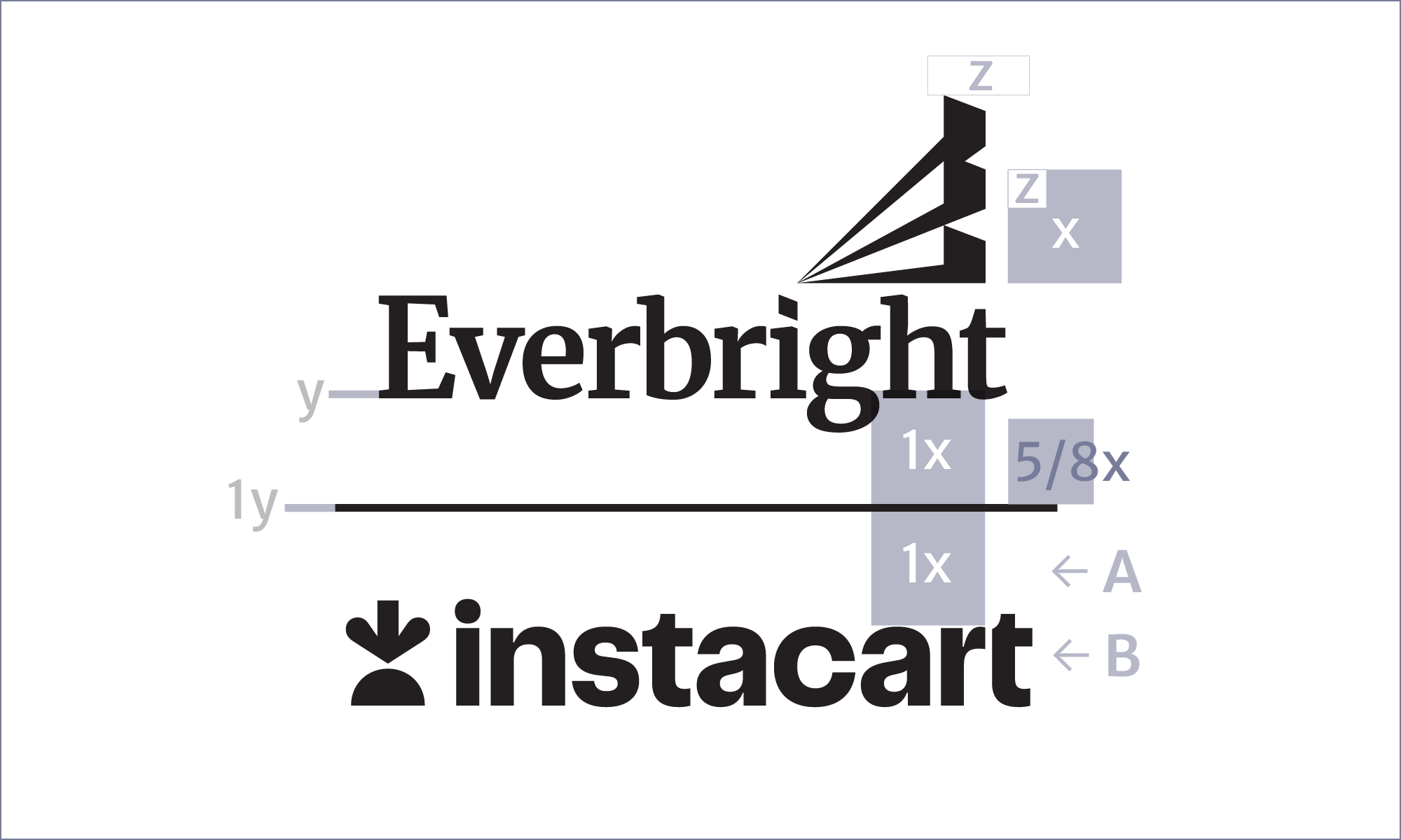
Vertical system
A: This white space needs to be visually balanced rather than mathematically correct
B: This logo size needs to visually match the weight of the Everbright logo
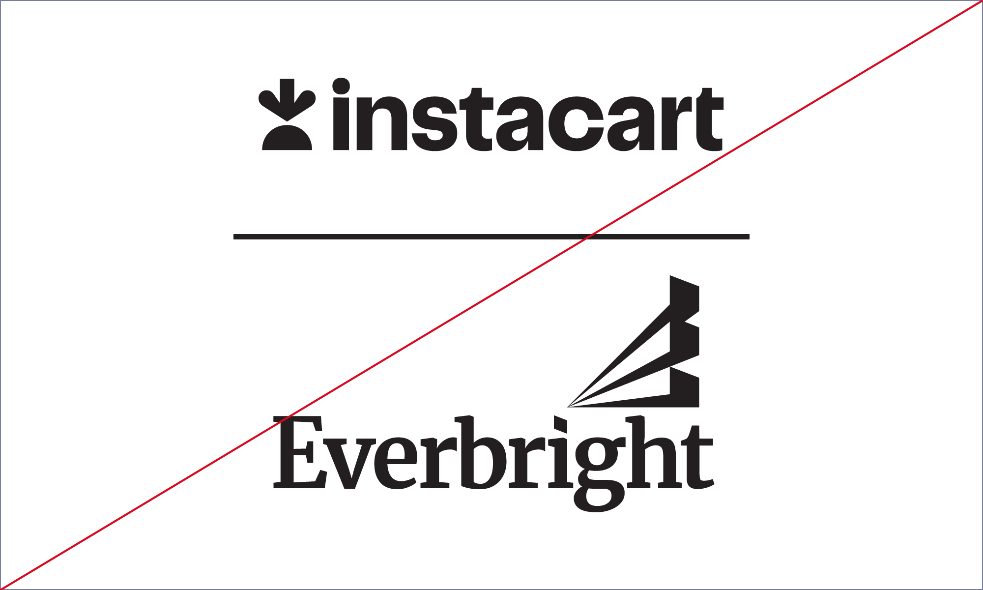
Misuse
Not recommended bc of our asymmetrical logo
Logo Color
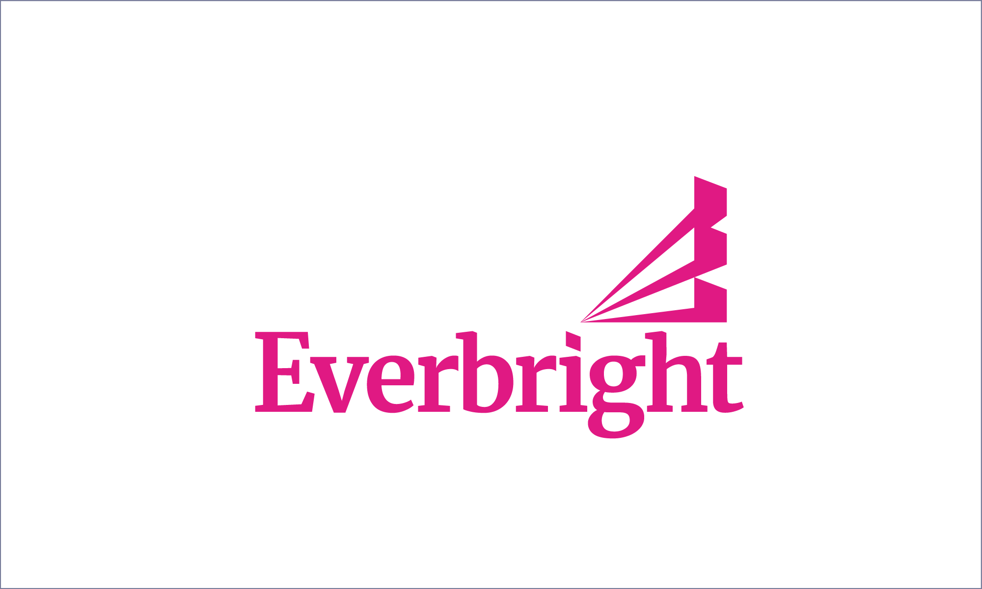
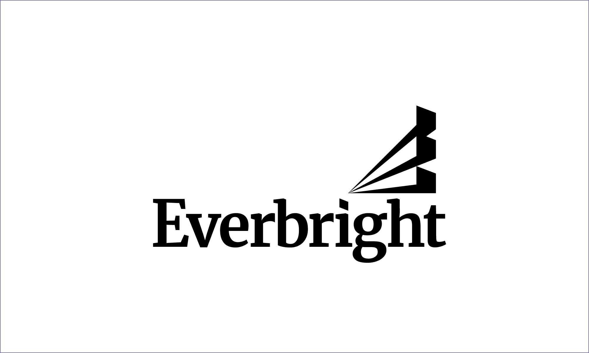
The Everbright logo should only be used in magenta, black, or white.
Logo Color
The Everbright logo should only be used in magenta, black, or white.


Social media icon
Our social media avatar is designed to stand out on any platform. Since it’s almost always connected to our username, it’s permissible to use only the icon, creating a strong and recognisable brand mark.
App icon
Following the same principles as our social media icon, Everbright’s app icon is designed to stand out in a jungle of other app icons.
Misuse
We encourage you to treat our logo with care and maintain its consistency across all platforms. It is important that it remains unaltered and true to its original design. Below, you’ll find examples of what not to do in order to help guide you in this process.
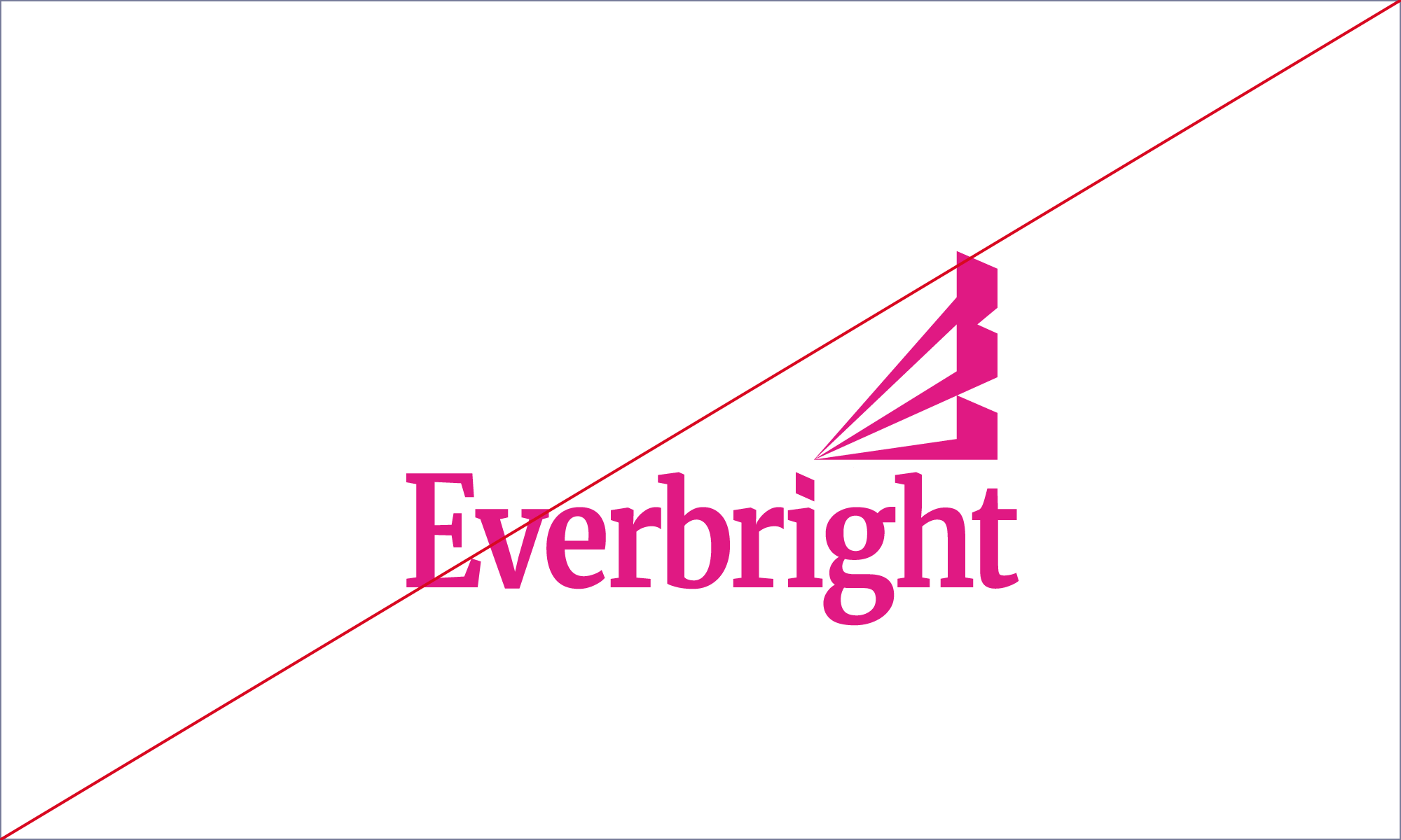
Do not distort the logo
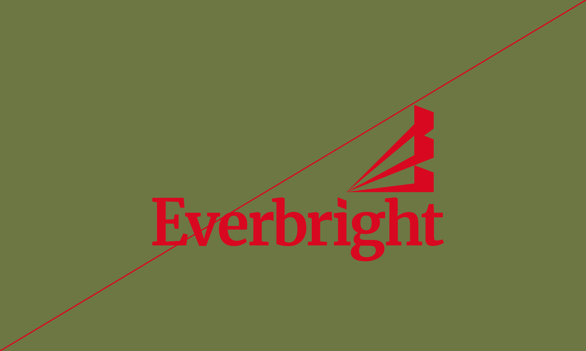
Do not apply a color to the logo and place it on a colored background
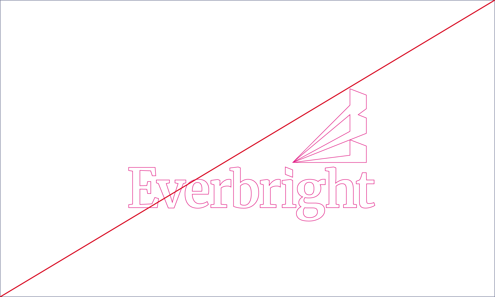
Do not outline the logo

Do not use the logo as part of typography. When referring to Everbright in running text, always use our brand typeface, Merriweather, in the same weight as the rest of the copy.

Do not place the logo vertically

Do not put a stroke on the logo

Do not apply drop shadow
Do not tilt or rotate the logo

Do not modify our clean black or clean white color
Do not use the logo as a frame for photography
