Typography
Our brand type family has been carefully curated for optimal legibility, flexibility, and functionality. We’ve chosen Google fonts, including Merriweather for titles, Nunito for eyebrows, and Merriweather Sans for body copy. Consistent and effective use of these fonts will enhance and strengthen our brand experience.
Brand Fonts
Below are the three brand fonts that are in use.

Merriweather

Merriweather Sans

Nunito
Merriweather comes in two selected main cuts: Merriweather Light (300), Merriweather Regular (400). No associated italics. Throughout the visual identity, Merriweather Light (300) is our go-to weight and utilised for titles and subtitles. Using Merriweather Regular is an exception to the rule when Light does not work.
Weights & Sizing

For subheadings, we use Merriweather Sans Semibold (600) and Semibold Italic sparingly. Merriweather Sans Light and Italic (both 300) for body copy.

Nunito Extra Light (200) are used for title eyebrows when applicable, and Nunito Light (300) if Extra LIght visually does not work.are the three brand fonts that are in use.

Alignment
Large typography should always be left-aligned or centered. It should never right-aligned or justified.


Misuse

Smaller typography should always be left-aligned. Never centered, right-aligned or justified

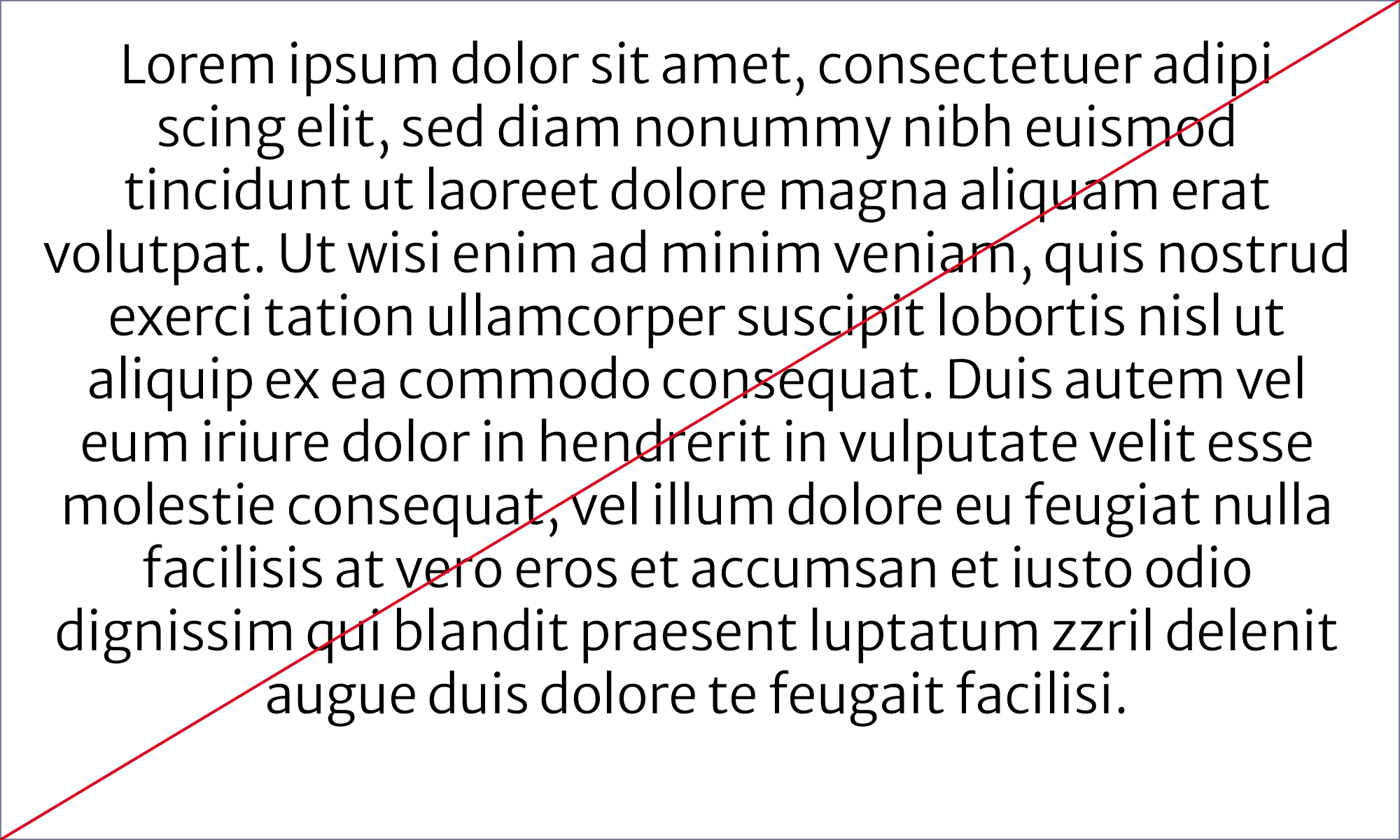
Misuse
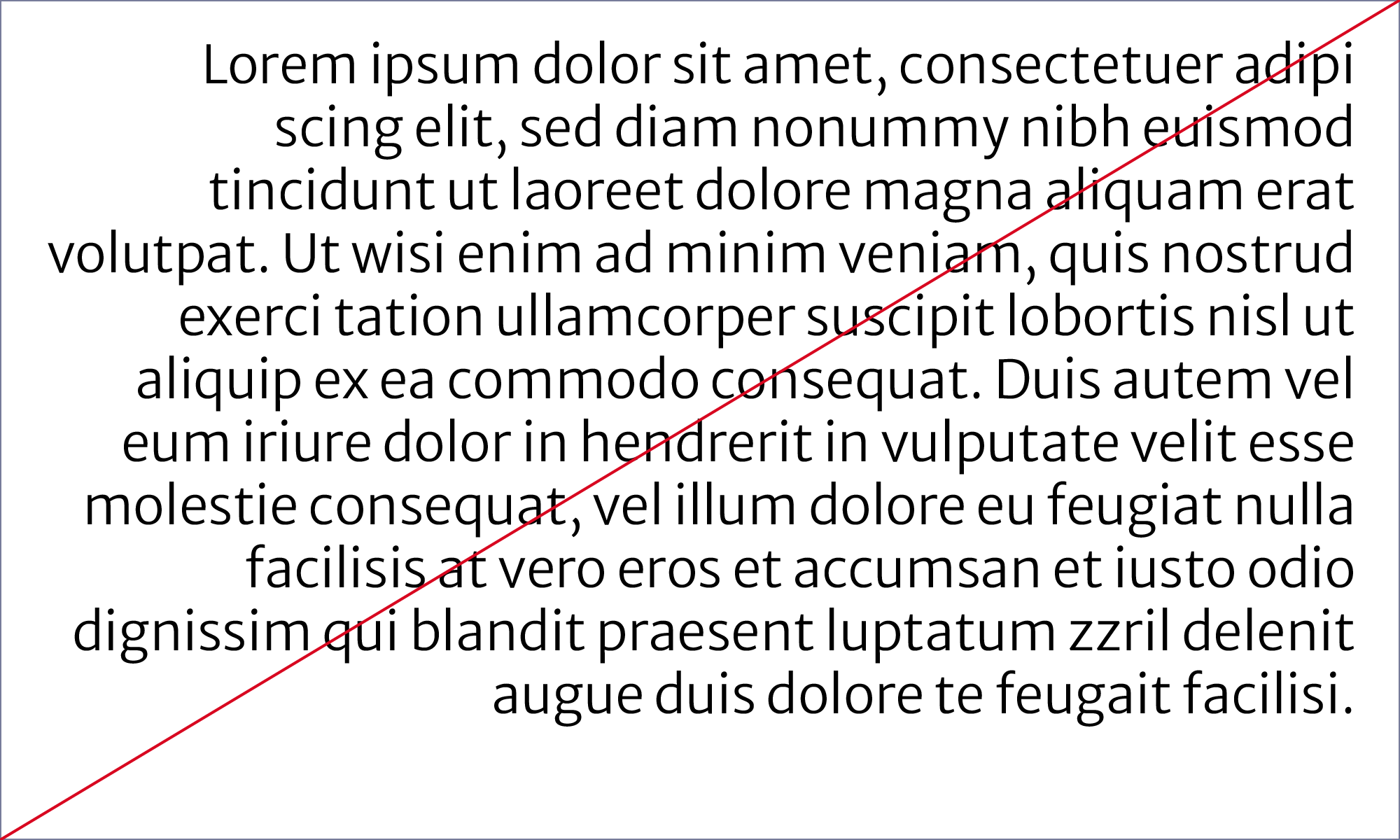

Margins
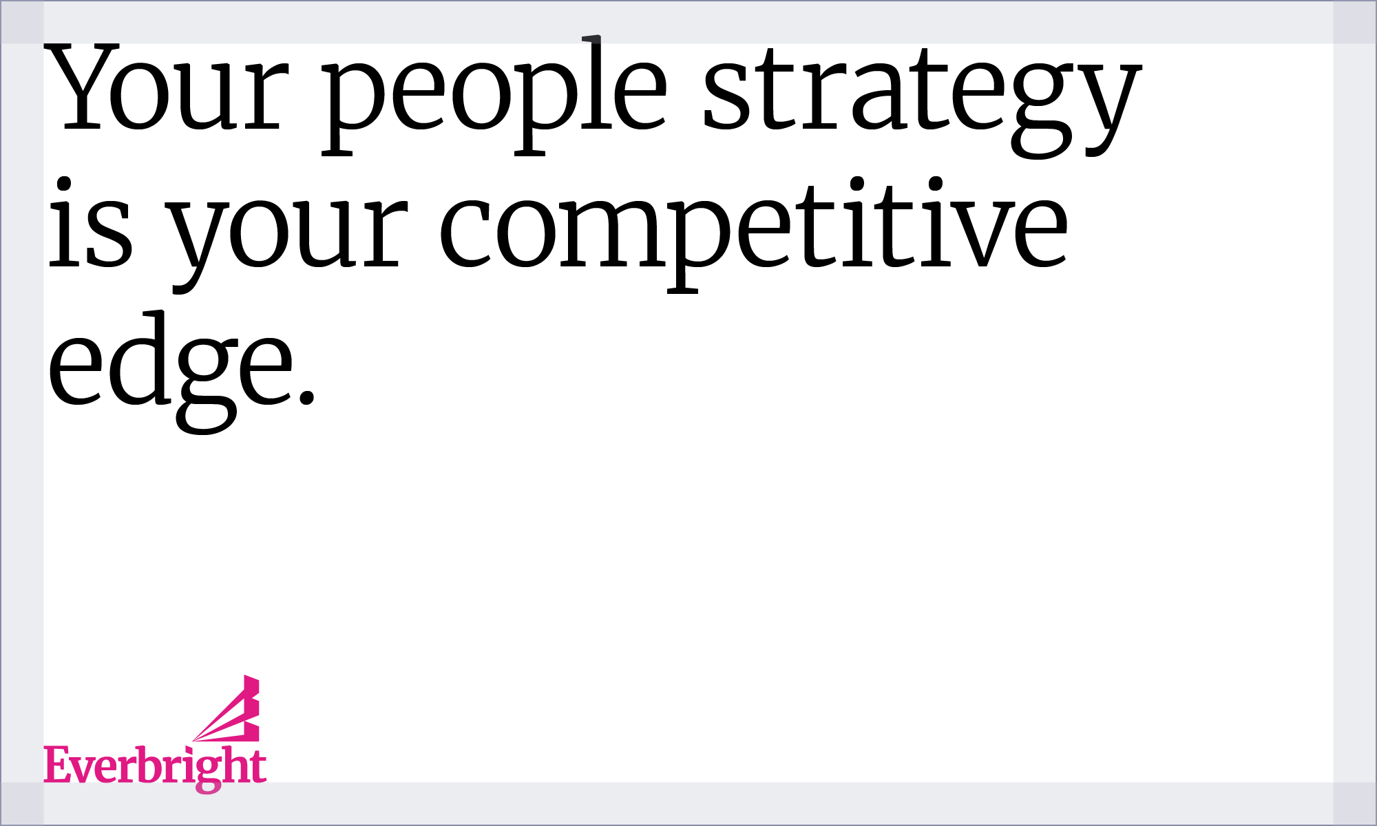
Our margins are decided from the grid margin principle. This varies based on the workspace. When margins have been set, make sure typography follows them.
Case
Sentence case

When setting type, sentence case should always be used unless working with the eyebrow using Nunito Extra Light font.

Never use all caps on titles, subtitles, and body copy. The only exception is when using Nunito font as an eyebrow
Tracking
Tracking is the spacing given to all letters in a word. Tracking should be quite tight. Too loose or too tight tracking should always be avoided. Below are some guidelines to follow.
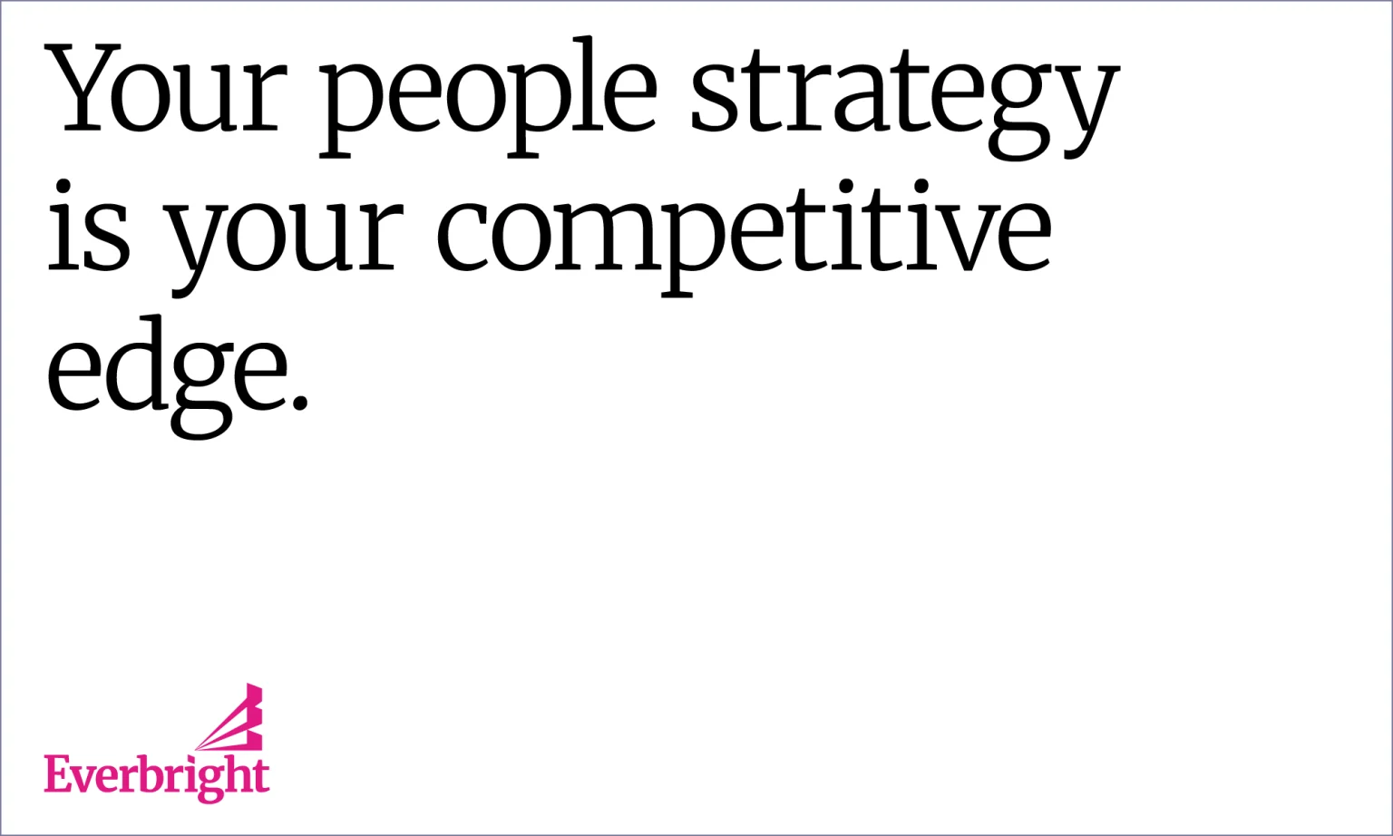
Correct tracking

Too tight tracking
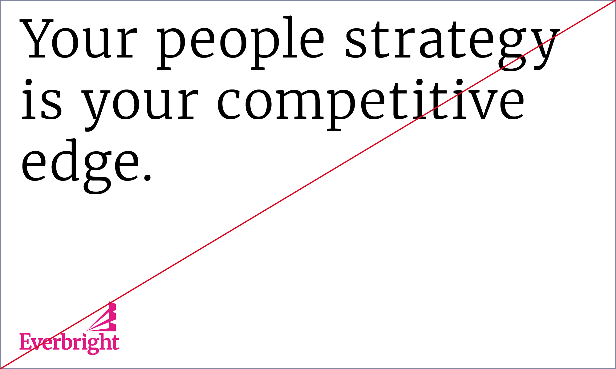
Too loose tracking
Kerning
Kerning is the spacing between each individual letter in a word. Once tracking is set correctly, go into each word and manually adjust the kerning to make sure it sits perfectly. When working in design software, kerning should always should be set to Optical for larger title sizes and Metric for smaller sizes . Below are some guidelines to follow.

OK kerning

Not OK kerning
Leading
Leading (also known as line spacing) is the space between lines of words. Leading should be optically bigger than the spacing between words, which again should be greater than the tracking. This will result in perfect legibility. Follow this principle for both print and digital type setting. When choosing your leading, be mindful that leading isn’t so tight that the descenders of the top line do not touch the ascenders of the line below it (which basically means that the lower parts of the g/j/p/q/y do not touch the upper parts of the b/d/f/h/k/l/t).

Correct leading

Too tight leading

Too loose leading
